
Human-Machine
Interface Design
for Lab automation
Designing the system workflow and digital interface for a first-of-its-kind automated Petri dish scanning machine from scratch.
Role
UX Designer & Systems Designer
Timeline
8 Weeks
Team
Cross-functional → Solo UX/HMI
Deliverables
Journey Maps · Cartridge Logic · Wireframes · HMI Prototype
CASE STUDY


01: OVERVIEW
Petri dish automation
·
Pick–scan–image–sort
·
Zero existing reference
A machine that had never existed before.
This project aimed to create a first-of-its-kind automated machine to scan Petri dishes, a process traditionally done by lab technicians.
The machine would use a robotic arm to pick up, scan, image, and sort each dish into positive, negative, or error cartridges.
I started as part of an industrial design team and transitioned to become the sole UX and HMI designer.
I initiated the end-to-end user journey mapping that aligned the entire team, then owned the design of the interface that would make the system safe and intuitive to operate.
The core challenge: there was no existing machine, no precedent, and no room for operator error.
A misloaded cartridge or accidental abort could waste hours of lab work and damage expensive equipment.
02: CHALLENGE
Human error
·
Physical constraints
·
System complexity
Four problems that
could each break everything.
Every design decision had direct consequences on expensive equipment and long-running lab processes. The constraints weren't just UX , they were physical and operational.
01
Physical design
Two dish sizes, one system
The machine had to handle both 65mm and 90mm Petri dishes within the same cartridge architecture without user confusion.
02
Systems design
Complex cartridge logic
Supporting full, empty, positive, negative, barcode error, and scan error cartridges : all of which had to be correctly loaded before a scan could begin.
03
Interaction design
Robotic arm sequencing
Designing the exact pick–scan–image–sort sequence so operators and engineers shared a common mental model of what the machine was doing at any moment.
04
Safety Critical UX
Preventing catastrophic errors
An accidental mid-cycle abort or misloaded cartridge could destroy hours of work. The HMI had to make dangerous actions nearly impossible to trigger accidentally
03: REASEARCH & SYSTEMS THINKING
User journey mapping
·
Dry-run simulations
·
Physical walk-throughs
Following the dish
from field to result.
I initiated and led full user journey mapping : tracing every step in the life of a Petri dish. This became the team's shared reference that aligned engineering, design, and product on how the entire system should work.
I also ran physical dry-run simulations using mock cartridges and props to walk through the full journey. These revealed common operator mistakes before any hardware was built.
01
Labeling & Collection
Dishes labeled and collected from field sites.
02
Loading into Cartridges
Technicians placed dishes into cartridges with handles for easy transfer to incubators.
03
Incubation
Cartridges stored in incubators until ready for scanning.
04
Loading the Machine
Required ≥1 full input cartridge + 2 empty contamination cartridges + 1 barcode error + 1 scan error. All had to be correctly placed before the machine would start.
05
Machine Processing
Robotic arm performed pick–scan–image–sort for each dish, routing to the correct output cartridge based on result.
06
Unloading & Post-Processing
Operators removed cartridges for further lab work or reuse. Safe hand-off was critical.
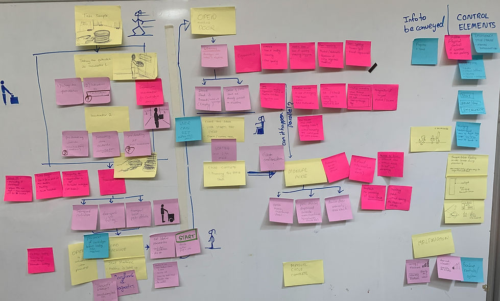
User journey map —
physical, machine, and cognitive activities and control elements needed based on activities

User journey map —
physical, machine, and cognitive activities
time-mapped across pre-machine, at-machine, and post-processing phases
04 : Information Architecture
Card sorting
·
Paper prototypes
·
Journey-based IA
Four stages.
One clear path.
Using card sorting, paper prototypes, and the user journey map, I divided the HMI into four distinct stages , each corresponding to a phase of physical operator activity.
This structure ensured the screen would always reflect what the operator was doing physically, reducing cognitive load at each transition.
01
Setup & Load
Guide operator through correct cartridge loading with validation before proceeding.
02
Scan in Progress
Live status of robotic arm, dish counts, and cartridge fill levels.
03
Error Handling
Interruption states for barcode errors, scan errors, and cartridge-full conditions.
04
Completion & Unload
Safe hand-off summary with results and confirmation before cartridge removal.
05: PROTOTYPING
Prototype Trial
·
User Testing
·
Validation
Testing the Prototype
on the machine.
The 'ideal flow' version: the user journey that was the most functional was prototyped in Figma and tested on the machine itself. This helped catch any mistakes as well as see the brilliance of the UX design live:)

Video of the UX being tested on the actual machine screen.
Figma prototype
06: VISUAL DESIGN
Light & dark modes
·
Safety-first hierarchy
·
Functional color system
Designed for
the lab environment.
After testing and validation of prototype, the interface was designed in both light and dark modes to accommodate varying lab lighting conditions. Visual hierarchy was built around safety: destructive actions required double confirmation and were visually de-emphasized by default.
Color was used functionally, not decoratively. Status indicators, cartridge fill levels, and error states all used a consistent coded system across both modes.

Light mode

Dark mode optimized for low-light environments
Process Dishes screen — cartridge load visualisation with minimum requirements panel and cycle start. Both light and dark modes designed for lab use.
"The concepts anticipate mistakes before they happen: exactly what we needed for an MVP."
-— Engineering Lead, stakeholder review
07: Outcome & Impact
Adopted by engineering
·
Error prevention
·
Stakeholder alignment
A blueprint the
engineers could build from.
The system blueprint was completed and adopted by the engineering team as the baseline for the prototype build. Simulation-driven cartridge logic changes and double-confirm dialogs significantly reduced the error states identified during dry runs.
90%
Reduction in simulated error states from dry-run changes
4
HMI stages adopted directly into the engineering specification
8w
From zero to full system blueprint and interactive prototype
08: REFLECTIONS
Adopted by engineering
·
Error prevention
·
Stakeholder alignment
What I learned
designing without precedent.
The system blueprint was completed and adopted by the engineering team as the baseline for the prototype build. Simulation-driven cartridge logic changes and double-confirm dialogs significantly reduced the error states identified during dry runs.
✓ What went well
Cross-disciplinary journey maps aligned engineering and design early. Starting with the physical journey — not screens — meant the interface was grounded in real operator behaviour from day one.
⚠ Challenge
Conceptual work meant no live hardware for real user testing. Dry-run simulations were effective but couldn't replace feedback from actual lab technicians on the real machine.
→ Next steps
Run usability tests with lab technicians, add accessibility checks for colour-blind alerts, and iterate the cartridge loading guidance based on observed error patterns.
